“welcome to our neck of the woods.”
creative direction
building a super green furniture brand by design
how does a mid-size manufacturer compete against the big multi-billion dollar players like steelcase and herman miller?
watson is a manufacturer of furniture for the commercial workplace. the 50-year-old company is nestled in the foothills of the majestic olympic mountains near Seattle. watson is revered for its progressive design solutions and sustainable manufacturing. the hum of the factory is built upon a spirit of industrial craftsmanship using wood and steel to make desks, workstations, and large meeting tables for the north American workplace.
cia served as chief design officer and vp of product development at watson, roles that allowed her to fuse product design, image, and brand over time.
watson factory headquarters
bringing clarity
when cia joined watson for the first time, she sought to elevate the company’s design voice. the promise of an aspiring design-forward business was masked behind an identity that did not hold its competitive weight against very large manufacturers like steelcase and herman miller. the goal was to find watson’s true character by design.
before
after

working with a small but mighty design and development team, cia began to grow the business's design value, gaining patents and sales with new products. the product language was intuitive and reconfigurable with sustainability integrated throughout.
building the brand by design
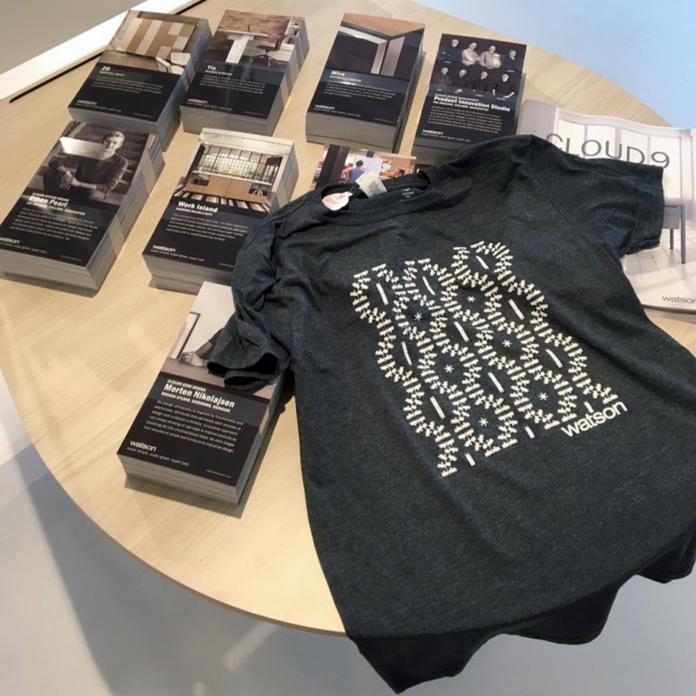
as we added touchpoints for the brand, we focused on a few good tools, sustainably considered. we developed a vocabulary of strong graphic patterns inspired by the cutout shapes of our steel parts and products. watson customers, who are primarily designers and architects of corporate interiors, appreciate the company’s subdued aesthetic and super green practices.
watson marketing team: michael shipley, art direction/lisa hope, marketing manager/kyle hoisington, 3d rendering/kerry tarullo, marketing associate

cia directed watson’s product development and marketing efforts building distinctive products and stories.
credits: furniture designs by morton nikolajsen and ethan pearl for watson launched under cia’s product development direction in collaboration with lucas pearl.
cia uses sketches to guide the narrative and cadence of product stories. words are thoughtfully chosen to distinguish critical market messages for sales teams and to set the brand tone.
watson collateral
watson product steel colors and surface materials
the brand color palette intentionally complements the materials used on watson products.
illustrated art is used for exploded or cut-away views of products that require deeper explanation. the illustrations follow the friendly character of a “sketch-up” style using muted tones.
videos show the bendable character of a new desking system with a central power raceway.
…and people enter into the storytelling of our workplace solutions including the skilled artisans who make the factory hum.

we ultimately refined the brand compass with the help of our consultant, lindsay pedersen at ironclad brand strategy.


